How To Match Colors From Image To Cross-Stitch Chart
Finding the "closest" color isn't always as easy as you might think ...
Contents
- Styles of Cross-Stitch
- How Does Image to Pattern Conversion Work?
- How a Computer Sees Color
- Red, Green and Blue
- What Do We Mean By “Closest”?
Introduction
Have you ever wondered exactly what is happening when you convert an image into a cross stitch pattern? It’s a lot more complicated than you might think and one of the easiest pieces to get wrong is figuring out which colors are the best match. Here’s what we learned from developing our own image to cross stitch converter app.
Styles of Cross-Stitch
There are three main styles of cross-stitch:
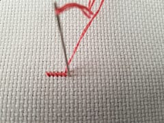
Samplers and line-art or cartoon-type graphics
Quick and fun and you can use whatever colors you have in you box, possibly even making up the design yourself as you go.

Not all of this style are “simple” - there are some very impressive and complex samplers out there that create beautiful and intricate pieces, such as Long Dog Samplers - Death by Cross Stitch:
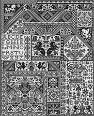
Simplified full-cover images
These are the “traditional style” cross-stitch that someone has probably designed manually (rather than converted from an image). They may be based off an image but are more of a simplified interpretation of it.
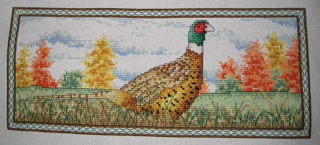
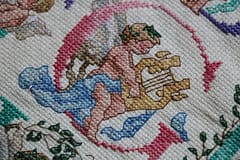
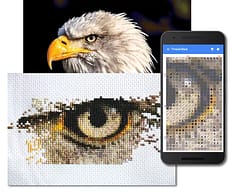
Full cover photo-realistic conversions (of photos or artwork)
This is where the pattern is created by converting an existing image (photo or artwork) into a cross-stitch chart and is what our own photo to pattern converter app does (you can also purchase downloadable apps or people provide it as a service).
The images produced are often photo-realistic and highly detailed. Here’s an example using our app:
For the first two, color is of course still going to be important but it doesn’t matter quite so much what the exact shade of them might be and they tend to be more solid blocks and there is no source image that we’re really trying to match things to. When you get into the photo-realistic conversions though the process of matching these colors becomes much more important.
How Does Image to Pattern Conversion Work?
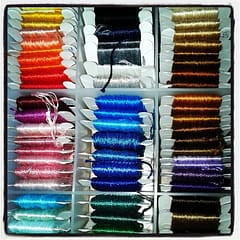
The technical image-processing term for the process of converting an image into a cross-stitch chart is called “color quantization” and means that we’re reducing the colors used to represent the image from any of 16-million in the original to a subset of the nearly 500 that DMC produce threads for. Note that it is a subset of the full thread range - typically we might want to only use 60 or so of these in a single pattern with 200+ as an ‘extreme’.
How does it work?
Let’s imagine an image has already been resized to the dimensions we want the pattern to be and let’s assume that is 480 x 320 pixels so we’ll have a pattern that is also 480 x 320 stitches (an exact 1:1 mapping between pixels and stitches).
We could start with the first pixel, go through our DMC color card and find what we think the closest color is to it and mark it down. Then the next pixel and so on. But that is going to take a long time - if we managed to do one every 30 seconds those 153,600 pixels would take 1,280 hours solid, or 160 days working 8 hours a day, or 32 5-day work-weeks!
Even when we do this, we might end up with way more colors than we actually want to use in our pattern, so which ones do we keep? Just chosing the most used may overpower the image and leave important detail without the colors they require. And then when we have cut the list down, how do we replace the colors that we have removed and which one of the remaining colors do we use? Do we have to go through the pixels again finding the closest color to the new reduced palette?
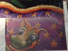
Of course no one is really going to do this by hand - it’s simply not possible. This is why the traditional-style cross-stitch looked like it did (much simpler) compared to modern full-color designs. It’s only because we have computers that are able to process images that it can now be automated and we can have the full-cover photo-realistic patterns generated in seconds.
The computer does what we would do but accurately and consistently with no mistakes - matching the color in each pixel to the colors available from DMC and then, via various algorithms, deciding what the most useful sub-set of those colors is to use to reproduce it (up-to the limit count we want to use). The computer can also perform other tricks that are even more time consuming than mapping the colors - alternating some of the colors (a process called error diffusion dithering) so that the pattern can approximate the shades in the original image even though those exact colors may not be available in the palette. If the replacement color for a stitch is slightly too dark, the “error” can be passed on the the surrounding pixels to make them slightly lighter to compensate - that is what gives rise to “confetti” in patterns.
The quality of the final pattern depends a great deal on which specific algorithms are used and how well they have been implemented but also, on two crucial factors:
- The accuracy of the thread color palette to pick from
- The accuracy of the color matching system
I’ve already written about the challenge of coming up with a completely accurate palette of thread colors so instead I’m going to explain the challenges of matching colors because even if you have the most accurate DMC colors the world has ever seen, if you use the wrong method to match them up your patterns aren’t going to look as good as they should.
How a Computer Sees Color
Most people are taught at least the basics of color in school and we probably have some vague recollection of primary colors and how they are mixed to create new ones. If you know even a little about computers or displays (monitors, TVs etc…) you probably know that they use RGB or Red + Green + Blue components to create the different colors we can see. Usually these are stored as a single byte which can store the numbers 0 to 255 and 0 means “none of this color” and 255 means “light it up!“. A byte is 8 bits in binary so 8 + 8 + 8 = 24 bit color and how we get the 16,777,216 different possible colors that most displays can produce (in theory, most displays can’t really display them all differently).
Red, Green and Blue
RGB is the color scheme that most people use because it’s convenient for computers to use and efficient for them to store images with so is the natural default. But it’s not the best system to work with for image processing. The reason for this is that we don’t see colors in a linear way. All white is RGB(255, 255, 255) and all black is RGB(0, 0, 0) so we might think that 50% gray would be half way in between - RGB(127, 127, 127) … right?
Well, we’d be wrong! RGB colors are more exponential rather than linear because our eyes can see differences in darker shades much better than lighter ones so the range that each number covers changes as you go up the scale. This was so the range of values could be compressed into a smaller space with more detail in the low end. The range is distorted precisely to fit into the limitations of computer technology when every byte was costly to store and to process. We also don’t see all color intensities the same - a bright red looks brighter than a bright blue for instance, it’s just how our eyes react to different hues.
So what does this mean? Well, if we ask what the closest RGB color is out of a set of other RGB colors we could very well get the wrong number. It comes down to what we mean by “closest”.
What Do We Mean By “Closest”?
Suppose I asked you what the closest city to Los Angeles was, a reasonable answer would be San Diego … but that’s assuming that I meant geographically, as the crow flies. What if, instead, I meant closest in terms of having a similar population or some other metric? Picking the closest RGB color is a little like this - we may get the one that is closest numerically but it isn’t necessarily the one that looks most similar which really, is what we want.
This is a solved problem though, actually solved way back in the 1930’s when a standard way of representing color was invented that modelled how human vision works. It takes into account that the receptors in our eyes don’t see the intensities of different frequencies of light in exactly the same way and we notice certain differences much more than we do others.
This is known as the CIE Lab color-space and for professional image editing it offers significant advantages - many of the great photos you see online start with the editor converting the RGB image to this other color space where more useful processing can be performed. Knowledge of RGB alone doesn’t make you a graphic professional - most real professionals know that they shouldn’t be using it. Isn’t it ironic that the system pre-dating computers turns out to be better than the one invented specifically for computers to use?
To demonstrate the difference it can make to our thread-matching task I ran a program to pick some random colors and then find the closest DMC thread color using both the simplistic RGB difference and also a more accurate method. Here are the results - the middle column is the random color, the left column is the closest match using RGB distance and the right colum the closest match using CIE Lab system:
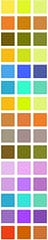
Hopefully most people will see the colors on the right are a better match to the ones in the middle than those on the left
It may not seem like a massive difference but with lots of pixels and colors throughout an image the effect sometimes can give an image a whole different appearance or just make the colors look a little “off” somehow. Using RGB has a tendency to make things look slightly blue - due to it not matching how our eyes see hues with different strengths.
Now the DMC color palette is already fairly distributed - inevitable as there are after all only ~500 colors to cover the +16million range, so most of the time the RGB matching is “good enough” and it is definitely much faster to do but the differences it introduces can be noticeable for certain images, especially when the multiple steps of matching colors are factored in. When you’re dealing with shades that are all close together, in areas of an image with smoother graduations, matching the wrong color can be very noticeable.
So why isn’t this better method simple used everywhere by default? Well, this is how you calculate the difference for RGB values using the typical “euclidean distance” formula:

Multiply each R, G and B value by itself and add them together - that’s math that even I can do!
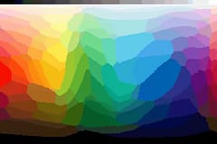
Here’s how a color spectrum comes out when converted to the closest colors using this method:
The more accurate calculation?
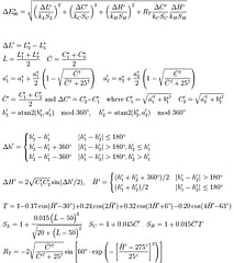
Yikes … real math! Even modern computer processors can choke when they need to calculate that formula multiple times for every pixel in an image.
But if quality matters, it’s really the only game in town. Fortunately, technology is always advancing and as well as CPUs we now have GPUs or “Graphics Processing Units” that can be used to speed up this kind of image processing (they are even available on mobile phones).
We intend to take advantage of these so you can have the best looking chart conversions possible and we’re also investigating some other interesting research papers on image processing to improve the color selection and dithering techniques to provide what we hope will be the best patterns possible and take things to a new level.
For comparison, here’s the same color spectrum mapped to the closest colors using the CIE Lab system:
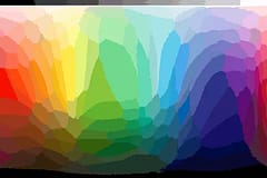
The places where they differ is where the two system would come up with different results for “which color is closest”.
So there you have it. Who would think that “what’s the closest color?” would be quite so difficult or there would be so many ways to do it (there are more methods and many more color spaces than the 2 I’ve mentioned here, it’s a fascinating topic to learn about). There are also a lot more involved in the process - such as how you decide which sub-set of colors is going to be most useful for the pattern as a whole (just picking the most-used may seem like it would be the answer but it rarely works).
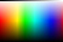
For reference, here is the original color spectrum image - if you compare it with the two above you should hopefully see that the CIE Lab one is more accurate (view from a distance / blur your eyes)
We hope you found this interesting and informative. As always, please like and follow us on our Thread-Bare Stitching Facebook Page or Thread-Bare Stitching Pinterest Channel for news and notification of future articles. Also checkout our Thread-Bare Flosstube Channel where we post videos about chart creation.