Why a Clear Cross-Stitch Pattern is Important
Format matters as much as the charting
Contents
- Introduction
- No Nickel and Diming
- Print Sizes Explained
- Black & White vs Color
- Page Pointers
- Index Sheet
- Pattern Overlap
- Thread List
- Fabric Sizes
- Symbols
- Conclusion
Introduction
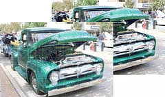
When purchasing a cross-stitch pattern (or complete kit) the thing that people tend to focus on most is the image. It makes sense because it is, after all, really what we’re buying - the completed piece that the pattern enables us to produce that we can hang on our wall.
The pattern is the guide to help us get there and the quality of the pattern can really define how difficult or enjoyable that journey is in the same way that you might get to the same place whether you have a clear and easy to follow map as if you have a confusing and unclear one, but one journey will be far more frustrating with the latter.
There is always the risk that if the map is too bad and leads to us making too many mistakes (taking too many detours and retracing our steps) then we may just give up on the adventure leaving a piece to languish in a draw, a waste of effort and materials.
So what makes a good cross stitch chart?
We’re very proud of the work we put into the PDF Pattern format of our image to cross-stitch chart conversion software and have received many nice complements, many people saying they are the nicest, easiest charts they have used, so instead of picking out what we don’t like from other system’s charts we’ll instead describe the features of ours and what we think makes them so good.
Feel free to compare them to the charts you’re used to and let us know which you prefer!
No Nickel and Diming
Before we even get to the chart formats themselves, we want to point out an important difference between our charts and many others. One thing we wanted to do right from the start is offer people excellent value for money and that meant getting away from the nickel-and-diming that we saw happening where if people lost their pattern, they had to pay to re-download it or if the pattern wasn’t clear and legible, they had to pay more again to get a larger print version.
With our patterns you can re-download them whenever you need and you get access to all variations of the chart at no extra charge. We initially offered black and white charts in 3 print sizes but we’ve recently expanded to include color versions of the charts (in the same print sizes) as well as a new Diamond Painting size which is designed to print out at 1:1 size to put between a light-box and a blank diamond painting canvas so that the canvas appears like a pre-printed one.
Again, all these charts are available to anyone who has already purchased a pattern at no additional charge and as we add new chart variations in future these will be too.
Print Sizes Explained
When we talk about print size, we’re talking about how large the symbols appear in the PDF and this really comes down to how much of the pattern is shown on any one page.
Large Print
Working with fine detail of the piece can really take a toll on your eyes so many people find a larger print size helps make the symbols of the pattern easier to read. This produces pages with 40x40 stitches per page. Note that we never split 10x10 blocks across pages as we find patterns that do this confusing to follow, especially if they also include an ‘overlap’ (more on that later).
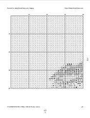
large print is easiest to read but uses more pages
Medium Print
The medium-print version outputs 60x70 stitches on a page and is recommended for most people.
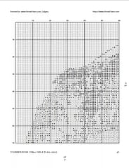
medium print is the perfect balance between readability and page count
Small Print
The small-print version has smaller symbols so gets 80x90 stitches on a page. This means that you’ll need the fewest number of pages to print the pattern out but the symbols may be hard to read if your eyesight isn’t great.
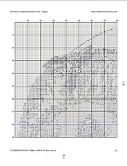
if you can read this, you’re standing too close …
Black & White vs Color
All the patterns show above are in black and white and while the black & white symbol versions of patterns are more familiar to many people, modern print technology has meant that high-quality color output is now widely available and some find the combination of symbol and color helps to make the patterns easier to follow and quicker to identify stitches plus it adds an extra check that the color you are stitching is correct.
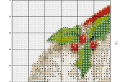
color together with symbols can make patterns easier to follow
Page Pointers
You may have noticed that the page above has a small “p6” pointer to the right. This is a page pointer and every page has these pointers to the adjacent pages so that if you are continuing stitching onto another page you know exactly which one to go to. This is to avoid a catastrophic mistake such as picking the wrong page of the pattern and having to ‘frog’ a lot of stitches wasting both time and material.
Index Sheet
We also provide an index sheet into the pattern showing the relationship to all the pages with the image. This also includes a red and blue line to mark the middle of the pattern (horizontal and vertical) which carries onto the pattern pages themselves.
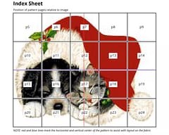
You can also see how the right hand edge of page 5 was pointing to page 6 as being the next adjacent one. If you look closely at the B&W print-size examples you’ll notice that the page adjacent to the bottom edge is different on each one as the different sizes mean there are a different number of pages used for each. The index page above is the large-print version which uses more pages.
Pattern Overlap
One final piece that helps when going to the next page is making sure that you are aligning the pattern in the right spot so you are not repeating or removing any stitches. We include a few repeated stitches from the previous page to the top and left to assist with that - they are shown in the pattern with a greyed out background and should not be stitched again but used to match up the next page of stitches. As previously mentioned, we never split a block across pages other than to show this overlap - every page always consists of complete blocks of 10x stitches to be stitched from that page and they are clearly numbered starting from the top left of the pattern.
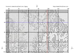
this example also shows the red and blue lines which denote the exact middle of the pattern on the fabric
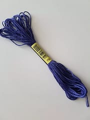
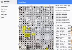
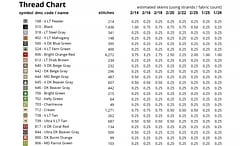
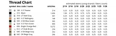
Thread List
One of the most important parts of any pattern, especially for the B&W version, is the symbol key to indicate which thread color should be used where that symbol is shown. For the color charts we show the thread color and symbol as it appears in the pattern but for B&W we show the symbol as it appears plus the color separately (in case you want to print that page in color as a reference to help when shopping for thread).
color version of chart
black and white symbol chart
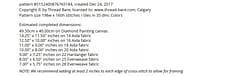
Skein Counts
For both chart types we also include a skein count which is the estimated number of standard DMC skeins you will need based on the number of stitches of each color in the pattern coupled depending on the number of strands and fabric count you are stitching with.
For example, if you are stitching “2 over” (using 2 strands) on 16 count fabric, you would read the 2/16 column above. For the 606 color that has just over 6,200 stitches the estimate is 3.25 skeins. This is your shopping list arranged in thread code order to (hopefully) match the craft store stock.
The reason we show the estimate to the nearest quarter is that it helps if you already have some in your thread-stash so you can decide how much more you need to buy and you may find that your personal stitching style means you are more frugal or more generous (you know we mean wasteful, right?) with your thread than the estimate so it helps to know if the estimate is just over or just under the next whole skein so you can adjust as necessary when purchasing.
Fabric Sizes
The skein counts for multiple fabric sizes may give you a hint that the pattern isn’t limited to a single fabric size as this makes absolutely no sense to us. This pattern is 198w x 160h and the pattern stays the same whatever fabric count you decide to stitch it on so suggesting that a pattern is “designed for 14 count” or “designed for 28 count” really demonstrates a lack of understanding and often causes unnecessary confusion.
What will change though is how large the final piece will be and we show this on the front page of the pattern:
Note the newly added Diamond Painting canvas size. Cross stitch patterns can be used for Diamond Painting but be sure to chose the DMC 447 palette (similar for stitching with CXC) as the new 01-35 DMC colors are not yet available.
Symbols
Coming up with clear, unambiguous symbols was actually one of the hardest parts of the process and we spent a lot of time picking out different symbols or ‘glyphs’, comparing them to all the others we were considering and rejecting any that appeared too similar to each other or that created weird effects when they appeared together in a pattern. We avoid triangles that were in the top left and bottom right for instance, limiting to ones that were at different angles so they were easier to make out.
We’re tried to arrange our symbols so that the clearest and ‘nicest’ (which is probably subjective) are used most often and the rest are only used for the lower-used colors when necessary (usually only on high color-count patterns). We may provide a way for you to set your own symbol preferences at some point in future.
We’ve seen horror stories where people have patterns that have very very similar symbols such as a black cross and then, they realize too late, an ever-so-slightly different sized black cross or one with a slightly extended arm - really the sort of thing that can result in a project being ruined if too many stitches have been done in the wrong color. We were determined to try and avoid those kinds of issues with our charts.
Stitching should be an enjoyable past-time, not an arduous challenge!
Conclusion
Many of these features may not seem huge in themselves and to be honest, some just seemed like ‘no brainers’ to us but they are based on hard-learned experience stitching poorly-generated charts that resulted in frustration, wasted work and abandoned projects. So, we put a lot of time into making ours as clear as possible so you’ll be less likely to make these mistakes with them. We even stick to a simple font because we prefer readability over something that ‘looks fancy’ but ultimately gets in the way of usability.
We’re very proud of our cross-stitch patterns and many people have said they are the nicest patterns to follow that they have ever used - high praise indeed!
The pattern isn’t the end goal of course - it’s just the map to help you reach the destination of having the completed piece hanging on your wall but we don’t want our excellent chart conversion process to be let down by shoddy charts and want to make the experience of stitching one of our patterns the best it can be.
I hope you found this interesting and informative. As always, please like and follow us on our Thread-Bare Stitching Facebook Page or Thread-Bare Stitching Pinterest Channel for news and notification of future articles. Also checkout our Thread-Bare Flosstube Channel