Creating Cross-Stitch Charts with Consistent Colors
Why is it so difficult?
Contents
- Introduction
- Communicating Color
- Capturing Color
- Monitor Calibration
- Pantone Color
- Official Colors for DMC?
- Why It Matters
- Color Quantization
- Existing Palettes
- Color Variations & Measurement
- The Perfect Palette
Introduction
What color is that thread? Is it the exact color you need in your pattern?
Doesn’t that sound like such a simple question?
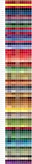
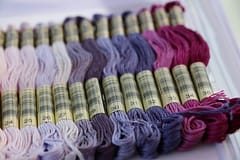
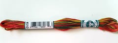
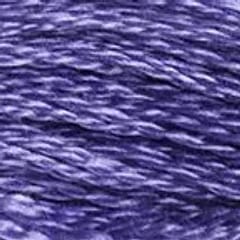
What may surprise you is that a craft that is so totally dependent on color doesn’t really have many clear answers. To show how much things can vary, I looked at how different apps, stores and websites represent the thread 3746 shown above:
Quite a difference eh? And that’s just one thread of hundreds. BTW: If you’re thinking you can match up the best one based on the photo above then read on, it’s not that simple …
Communicating Color
The first challenge is communicating color. At a basic level we often use words like “blue” and “red” (any of the 7 possible colors if you’re a man or many thousand paint and fabric shades if you’re a woman - c’mon, what is “Teracotta”? Can’t we just say “Posh Orange”?).
But those don’t really communicate color to reproduce it in a completely accurate way, we tend to just be talking about the major hue at that level.
For cross-stitching thread, the standard way to communicate is using the codes that the manufacturer assigns which will often be DMC or Anchor. Imagine if we didn’t have those and you had to remember the shade of red you needed from the craft store, or describe it over the phone to someone when placing an order? Instead we have a code we can identify it with such as 666 for a beautiful Christmas Red (incidentally, Santa is an anagram of Satan so 666? … maybe it’s some kind of Da Vinci Code clue?!).
That’s fine if we already know the code for the color, but what if we’re starting with the color and want to find the code to match it? Maybe we want to create a picture and need to convert from a pixel in an image into a stitch in a pattern - how do we work out what color thread to use?
Capturing Color
The problem starts with so many factors impacting how we even see color.
First of all, we may not be blessed with perfect vision. Many people have various degrees of color-blindness and humans in general can see some of the color spectrum better than others anyway.
Next up is the lighting. If we’re indoors under tungsten lighting then that will color what we’re seeing (the orange glow you may see on photos). Even if we’re outside in daylight, the light changes depending on the weather, the time of day and even the season and how far away from the equator we are.
Even objects nearby may reflect light and change how we see color.
If you think you can see color accurately, then look at these fascinating optical illusions show how color can trick the eye. The fact is that we can’t tell accurately what colors are.
But that’s OK - we can use a camera! … Right?
Well, sadly, cameras are a lot like we are. Even the expensive high-end cameras can’t be relied on to accurately capture the color of something perfectly. A professional photographer will use a known and accurately produced color reference card that can be photographed and used later by software to correct for the camera sensor, lens and lighting combination used for that shot. This is especially important if the photo is going to be reproduced in a magazine or serve as any kind of reference.
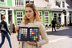
using a SpyderCHECKr color reference card to ensure accurate color capture in a scene
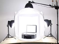
If we’re trying to accurately capture the color of thread, we’d need to use a card and be photographing it in a “clean” light environment such as a photographic light tent, the kind used to produce clear product shots:
So, we finally have the accurate color images! Well, not quite.
We might be able to accurately capture the colors (or more correctly, adjust the colors we capture based on the reference card so that they are more accurate). But are we still seeing the correct color and how do we match it to the thread?
If you try to hold a skein of thread up to something shown on the monitor, you’ll probably have a hard time. Part of this is because we’re dealing with two fundamentally different ways to represent color.
The monitor is using additive color and mixing light in different quantities of Red, Green and Blue to create the desired shade. Add all the color at maximum level and you get white.
Thread uses subtractive color which is more like mixing paint (and often uses cyan, magenta, yellow, and black instead of the ‘RGB’ used for displays). If we “add all the paint” then instead of white we get black.
One is emitting different amounts of light, the other is reflecting light.
Monitor Calibration
Just like the camera, to have the monitor accurately represent the color it needs to be calibrated. Chances are yours isn’t (it’s expensive) and most manufacturers want their monitors to look bright and vivid rather than super-accurate so tend default the settings to provide higher contrast and color saturation than is normal. They also come with Movie or Game mode settings that can dramatically change the look - often to cater for different refresh speeds and smoothness rather than color accuracy. Many displays simply aren’t even capable of displaying the full color-space however much we fiddle with the settings.
But I recommend spending some time to calibrate your monitor - it can only help.
Pantone Color
The issues of reproducing colors has been solved - companies make a business out of creating a way for people to accurately communicate and specify colors.
If you want to have something printed on the other side of the world and have complete confidence that it matches something in front of you, there are systems to communicate and reproduce it exactly. PANTONE Color Matching System is one solution but it doesn’t come cheap - a Pantone reference library is $1,620 for instance.
Official Colors for DMC?
In an ideal world DMC would provide the official colors for their range using some other established system such as Pantone or RGB codes so we know exactly what colors they are and not just their own inventory codes.
But sadly, for whatever reasons, they do not.
I suspect it may simply be that they see no value in it for themselves, consider it proprietary information (making it easier for competitors to “steal” their color range?) and it would also possibly hold them to a higher standard than the sample color-cards they currently produce. Right now, colors can drift over time and there is no definitive “correct” color that they have to match.
Whatever the reasons, we’re left to try and figure out the colors to use ourselves.
Why It Matters
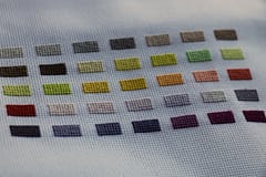
If we’re just picking a thread out of a collection and designing something simple or cartoon / illustration like it probably doesn’t matter a great deal. If instead we’re trying to convert a photograph into a cross-stitch pattern it matters a great deal. To do this we’re almost certainly going to be using a computer program and as I’ve described in previous blog articles, they work by reducing the resolution and color palette of an image.
Color Quantization
The color reduction is done using a process called “quantization” and means we want to use maybe just 60 colors instead of the 16 million possible in the original image. Obviously, it has to make compromises to do this! The simplest systems just match each pixel to the closest DMC color based on the mathematical distance of the Red, Green, and Blue values. A more refined application will take into account that the human eye sees colors of different hues and brightness differently and so will pick the closest taking the peculiarities of human vision into account. Systems can also dither the colors - effectively mixing the few colors it has to give the effect of there being more. All reasons why some apps can produce better results than others.
But this all relies on the idea that the palette of thread colors that the computer knows about and can select from is accurate.
Suppose the computer decides that the correct color for a piece of sky is a light shade of blue - if the actual thread is a very light shade of purple instead then this will be how the picture comes out.
In reality, it’s rarely going to make a monumental difference and may hardly be noticable for many pictures unless we compare the same image with two different palettes - the picture looks great as a picture and isn’t a photo that can accurately represent the original colors anyway, but it is still a difference and if we’re trying to make our charts as accurate and refined as possible we want the thread color list to be as accurate as we can possibly make it.
Existing Palettes
When I first started working on a photo to cross-stitch pattern making website I looked around to find what I thought would be a definitive official set but instead found lists that various people had put together. One has this disclaimer:
“Notes and Caveats: This chart was created by someone who is slightly colourblind and has no training in color theory/matching. It was made by taking corresponding RGB values from a Pantone to RGB conversion table and then finding the closest match to said ordered triple in the DMC to RGB conversion table. “Closest match” here is described as “minimum sum of the shares of the difference in R, G and B values respectively”/ It’s really meant to be a tool to help folks who can’t color match well (like me) to get started. It’s not a replacement for a color card, a fancy color meter or a good pair of eyes. Also, remember that a lot of the quality of floss (for DMC cotton color values) and printed matter (for Pantone codes) are lost when translating them to the RGB color space. When in doubt, use your artistic sense!”
I’m not picking on the author who must have gone to enormous trouble to make the chart and did a great job - they are actually the one that I found that included any kind of description of the process used and explanation of the challenges and shortcomings. The problem with most of the various color sets is that you don’t know anything about how they were created.
Color Variations & Measurement
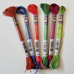
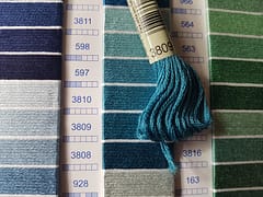
Of course we’re limited to the quality and consistency of our thread manufacturer. We’re effectively going to identify the specific color of a thread and assume that every thread out of every batch all over the world forever more is the exact same color. It probably won’t be but we want our chosen color to be the most likely to be the closest match most often.
The best reference we can probably get is from the manufacturer and while they may not be willing to provide us with the specific list of color codes, they do provide product photos and reference color cards.
And so we almost come full circle - what color is that thread, even if we have an accurate photo of it?
Where exactly do you measure the color? The highlight? The shadow? The pieces in between? Although we want a single color, it is a 3D object and different parts are reflecting light and casting shadows. Whatever single point we use to measure, the readings will differ.
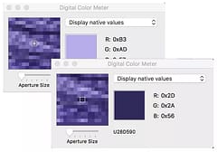
color can vary wildly based on where we sample if using a single point
We could average out a slightly larger area using the sampling tool but even then, the results may vary based on exactly where we do the sampling.
Remember that original example showing the variation of colors? I believe this is why there are so many different palettes floating around. None of them are exactly right or wrong (but some seem to be less right than others when you see them all together).
The Perfect Palette
So, I’ve been on a quest to see exactly how much variation there is between all the different colors and to create the best thread palette that I can using … science!
The existing palettes available are easy because they already provide a single color in color-code format and they would serve as the starting point to compare other things against.
Most stores and DMCs own website only provide images of the threads so the first step was to capture and analyze those and as always, there are quick and easy ways to do it and more “computer sciency” ways of approaching it.
The simple way involves taking the image, adding up all the colors and dividing by the number of pixels - yes, it’s just a simple average.
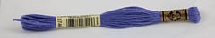
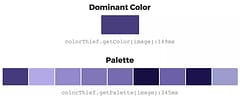
The more complex approach involves “median cut quantization” and “k-means clustering” which boils down to finding out the most representative color. Here’s the main color that one method detects for the thread sample above and also the other colors detected in the image:
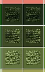
For most of the images the two different techniques produced very similar results which was great - they validate the results somewhat. There were more noticeable differences for some of the image samples though such as these where the best matching color that each algorithm came up with still matches the image but the image itself varies:
On the whole though, the biggest variation by far was between the various sources. Some have much brighter colors, others are more muted. Some look “wrong” in that the relative colors within the same set don’t make sense (like the light and dark version of a color not being lighter & darker).
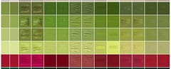
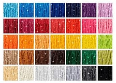
each row is a single DMC color, with colums representing different sources & the result of the different color selection algorithms
Some of the rows have real outlying values to the extent that I think a few images may have been assigned the wrong code at some point - I’ll contact the sites involved so they can check and correct if necessary. At one point I thought about averaging the colors from all the different sources but having started checking them against actual skeins, I think it’s better to pick the best source but then correct the values that seem to disagree if there is more consensus with the others.
I was pleased to see that the color palette we’d already used and tweaked came out pretty well but I will be spending some time refining a few of the entries further based on the actual thread samples and the results of this experiment (which also includes our own sampling using the same lightbox and color calibration card shown earlier).
As well as validating and improving the existing DMC color palette we’re also already building in support for the 35 new DMC colors they have just announced and will make a future post to announce when they are available to use and to show what effect they can have on charts for different pictures.
But I still hope that DMC will one day release an official list of colors for their products. For now, I’ve included just part of the output from the experiment.
Thanks for reading and as always, please like our videos and follow our us on our Thread-Bare Stitching Facebook Page or Thread-Bare Stitching Pinterest Channel for news and notification of future articles.