Anti-Aliasing For Better Looking Cross-Stitch Charts
Just drawing a straight line isn't as simple as it sounds
Contents
Introduction
Anti-what-now? We’ve talked before about size, color, sharpening and dithering for custom cross-stitch chart-design and also some of the “secrets” behind the chart-making process. Now we’re going to talk about another image processing-related feature that affects the quality of charts, something called “anti-aliasing”.
Most computers now have displays made up of individual pixels arranged in a grid to produce “raster images” - literally, a grid of dots. That wasn’t always the case though - if you’re old enough to remember the original Asteroids arcade game, that had a “vector image” display which could draw smooth lines in any direction, used to draw the rocks that glided across the screen and smashed your little spaceship to pieces so you had to put another 10p in the slot.
Nowadays, your computer will almost certainly have some form of LCD display and the only mention of vector images refers to the format of the image file - to display something on the screen it’s always converted to the grid of pixels.
The Problem With Pixels
Pixels work great. They are now much sharper and clearer than the older CRT type displays we used to have to use (especially the green-screen ones - you kids, you’re spoiled!).
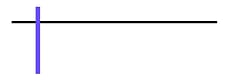
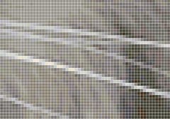
But there is a problem with pixels which is the grid. If you are drawing completely vertical or completely horizontal lines, then they will be incredibly sharp and well defined. Just look at this incredible artwork I came up with. So much sharpness, you could cut yourself:
But when you try and draw any kind of diagonal line, you get this stepped edge effect (zoomed in to show detail):
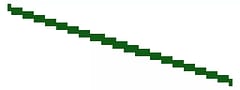
Guess what has lots of not-perfectly-vertical and not-perfectly-horizontal lines?
Life!
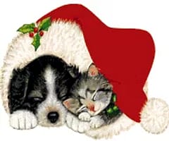
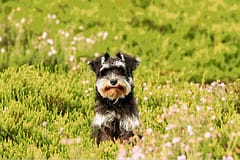
So you may not really think about it consciously but when you see a photo, it’s normally got lots of lines going all over the place. The whiskers on that cute cat photo don’t all stick out perfectly aligned in a grid, they curve and slant (I’m pretty sure all cats are like that, not just ours).
Even if you just draw the line we did earlier, modern displays have very high resolution displays, what Apple made popular as “retina” screens. Because there are so many dots and they are so small, your eye can’t make out the jagged edges as easily so everything looks smooth and sharp. Even phones now have many more pixels than huge monitors did many years ago. We used to wonder at how sharp laser printers were when they first came out and it’s because they printed at 300 Dots Per Inch (DPI) and nowadays phone screens offer similar or even higher resolution.
High Resolution Isn’t An Option
But we’re not stitching retina-resolution charts. At 300 DPI your medium-sized 300px piece would just be an inch wide, like a postage stamp (bring a magnifying glass!). As I showed in the last article on chart design, there are real hard practical limits to how big a pattern can be before it’s simply not achievable and the limit for chart size is much lower than the point that the resolution would hide any jagged edges.
Creating a cross-stitch chart is very similar in many ways to some of the issues that older computers faced when trying to display images. You want the picture to look good on the screen (the fabric) but you are limited by the resolution (the stitch count).
Fake it, till you make it
If you can’t make the resolution higher because of the limit, the other thing you can do is add color. How does adding more color make the lines smoother? Well, that’s where anti-aliasing comes in.
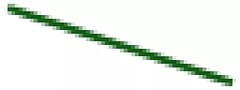
Imagine we go back to our jagged diagonal line. It’s jagged because there are only two colors and as the line slants down each pixel has to be either green or white as the threshold of whether the majority of the pixel would be colored or white switches over.
If we could split these pixels up, they could be colored independently which is what higher resolution provides. But if we add some extra, slightly lighter colored, pixels to fill in some of the corners then it can give the illusion that the line is smoother than it really is.
it looks smoother from a distance, when zoomed out
This is the same trick that computers have used for a long time to make fonts look more readable on screen. When displays were much lower resolution than they are today, displaying nice fonts was a challenge because there simply weren’t many pixels available in the space a character took and so they could look very pixelated. Anti aliasing made them look much smoother and crisper even though, when you zoomed in, they weren’t.
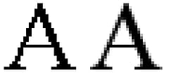
the anti-aliased letter on the right looks smoother
image By Mwyann, Wikimedia Commons
If I asked you what color that letter was, you’d probably say black. The one on the left with the jagged edges is but the anti-aliased one isn’t just black, it uses multiple shades of grey to achieve the smoothing effect. This is what we mean by adding color.
Interestingly, as an aside, some of the font-smoothing actually uses colored pixels as well and your eye still sees them as sharp black and white letters on the screen. You may remember having a prompt on earlier versions of Windows to “tune” the TrueType font rendering as it used this effect and depended on the layout of the colors used in the LCD monitor to achieve the best effect.
Of course, the color comes at a cost. While you can ramp up the number of colors in your image, you probably don’t want to go too overboard as that makes the pattern more expensive to buy supplies for and more time consuming and difficult to stitch because of the constant thread-color changes - what’s known as “confetti”.
So what does this look like with a cross-stitch chart and how do you “do” anti-aliasing? Well the good news is that it’s pretty much done for you. If you use any decent image processing software it will have an option to resize and apply anti-aliasing to the image. This will help to keep the non aligned lines looking smooth and sharp.
Here’s an example of a fantastic cat image from pixabay made into a pattern. Even though the image resolution has been reduced, the software can anti-alias the lines of the whiskers so that they still appear smooth despite the lower limited resolution.
Anti aliasing, it really is the cat’s whiskers!
I personally don’t believe that you can realistically achieve anything but very simplistic anti-aliasing doing it by hand. The computer resizing algorithm is nearly always going to do a significantly better job and is designed to know how to “fool the eye” into seeing smoother lines than are really possible.
The important thing to remember is that as you limit the number of colors available in the image as a whole, it may need to compromise how smooth the color variations are. This is the balancing act when creating a chart - getting the resolution and the colors to the right levels so the pattern looks great but is easy (enough) to stitch.
But now you know why the smooth line in your original image may come out as a series of color gradients in the pattern. It’s to smooth the jagged edges that would otherwise appear.
As always, please like our videos and follow our us on our Thread-Bare Stitching Facebook Page or Thread-Bare Stitching Pinterest Channel for news and future articles.