Size, Color, Sharpening & Dithering for Custom Cross-Stitch Chart Design
Choosing the best options to produce great looking patterns
Contents
Introduction
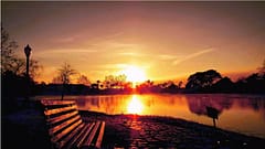
Completing a rich, beautiful cross-stitch piece can take a long period of time and considerable effort as well as the cost of materials involved. If you’re going to work on even a moderate sized piece, you want to be sure it’s going to look good before you start. It all begins with the patten design to create the best chart possible..
But there’s always a balance to find. Of course making the pattern incredibly detailed and using every color in the DMC palette will look absolutely fantastic - but it will also add to the time, effort and cost to complete. Often you can reduce the size or reduce the number of colors without any noticeable impact on the finished design. In fact, using the right options can make it look even better while also making it easier and less expensive to produce.
We’ll show some examples of pattern creation and the decision-making that goes into selecting the parameters available. Some of the examples use smaller images than you may want to use to emphasize the results and make the differences more obvious but the principles apply no matter what design you’re working with.
But first, let’s clarify what we mean by some of the terms:
Size of Pattern
Size is the thread dimension of the pattern. We use thread dimension rather than a measurement like inches because the finished size will really depend on the stitches-per-inch count of the fabric you use when stitching it. For example, here are the estimated sizes for the same 300W x 200H stitch pattern on various fabrics:
- 21.50” x 14.25” with 14 Aida
- 18.75” x 12.50” with 16 Aida
- 16.75” x 11.00” with 18 Aida
- 15.00” x 10.00” with 20 Aida
- 13.75” x 9.00” with 22 Hardanger
- 12.00” x 8.00” with 25 Evenweave
- 10.75” x 7.00” with 28 Evenweave
Read more about how to calculate fabric size correctly.
You can of course also work backwards from the physical dimensions to the threads - if you want a 10” x 8” sized piece to fill an antique frame and you want to do it on 20 count Aida fabric then the dimensions would be 10”x20 by 8”x20 or 200W x 160H and you would create a pattern design of that size.
The size of the pattern will really dictate how much detail it can contain in exactly the same way that a high-resolution camera will typically produce more detailed images than a lower-resolution one - it’s all about the number of pixels or stitches in the image.
a lower resolution image is never going to contain the same detail but can still make a good picture
Of course, while a high-resolution cross-stitch pattern will look great, you’re going to have to make all those stitches! You can multiply the width by the height to find the total number. That 200W x 160H design may not sound like a lot but it will be 32,000 stitches to complete. So chose a size to suit your experience and the time commitment you have available vs how long you want to spend working on it.
Remember the 3 feet rule - people won’t typically be looking at the image from the 6-inches you are while you’re working on it … not all that detail is required.
But don’t worry, there are ways to make even “low res” patterns look good …
Color Count / Palette Size
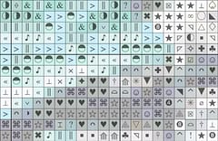
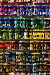
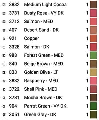
Next up is the color count or palette size which is the number of different threads used in the image. Again, there is a balance to be had - DMC manufactures threads in over 400 hues but it’s unlikely you will need more than 100 to create a great looking piece and often 30-70 can look great.
The more colors you have, the more often you’ll be switching between them which can make a piece take longer to complete although certainly less boring than working on large patches of solid color (it depends what you like though). Also worth bearing in mind are how many stitches there are of each color. Do you really want to buy a skein of cotton just for a single solitary stitch in a pattern? Whether or not you have a supply of threads built up might factor in to your color-palette options.
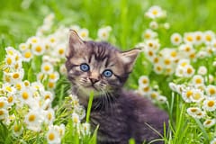
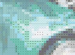
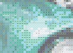
When you create a cross-stitch pattern from an existing image or photo what you are usually doing is reducing both the image size and the colors. Whether it’s a photo of a pet, a grandchild or a mountain landscape, it’s inevitably going to be at a much higher resolution than you want to stitch and have many more colors than are even available as threads from DMC (they make hundreds but photo colors are in the millions).
There’s no way to reduce the image size and palette without effectively “throwing away” some of the information in the image. When done well, the end result will still look good but done badly will make the image look flat, blurred and with “blotches” of unnatural-looking color where they have been replaced with the closest thread equivalent based on the even more limited palette of “how many colors do you want to use”.
As computer science has evolved, people have developed more sophisticated algorithms to retain as much detail in an image after resizing. That’s why photo-realistic cross-stitch patterns are now possible vs the traditional flat type designs.
But how do you decide how many colors to use? The best number will depend on the image and the resolution you are designing for (tip: spend some time trying different sizes at different color counts). One way is to start with a high number of colors and gradually reduce it until the image quality starts to noticeably degrade. You might also want to look at the number of stitches of each color - if you have a high number of single-stitch colors it may be a sign that you still have too many (not always - sometimes these low-count threads may be used in critical areas for detail).
Here’s a video showing the colors used being gradually reduced from 160 to 20 (check the number in the top right). It hardly changes much initially and differences only starts to become noticeable around the 100+ count mark with the fire-hydrant and truck panels losing some color depth (which we may not care about as they are not the main focus of the picture). Things still looks good down to 90 then changes start to become more pronounced around 70-80 and significantly worse once it goes below 50.
NOTE: it’s important that whatever software you use provides instant feedback as you make adjustments - having to restart from importing the image each time would significantly impact your ability to create the best pattern possible.
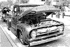
Another option to consider when it comes to color is … well, not color. The image looked bad below 30, almost black-and-white. If we actively limit the colors to just greyscale (by applying a filter) then we’re back to a pretty decent looking image:
For a vintage look, we can use sepia tone instead:
These work and look good even at low color counts because there are no hues (or a single hue) involved, just the shade / intensity. What might have been separate colors for red, green and blue parts of the image can all be replaced with a single grey or sepia color which is why an image filtered this way can still look great with 1/3rd of the colors or less.
But let’s stick to color and use 90 as a decent value to show the next options.
Sharpening
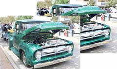
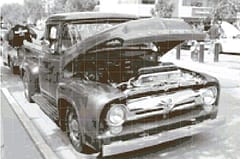
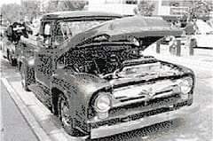
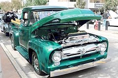
Reducing the image size can result in a softer, sometimes slightly blurred looking image and it’s particularly noticeable in edges and other detail. Whether this is good or bad will depend on the image - for your car we would probably prefer it to look crisp and sharp but if you’re making a pattern of your mother-in-law, she might not thank you for making lines appear sharper and more defined!
Here’s our car at 200W stitches and 90 colors with no sharpening:

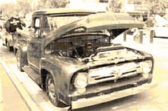
vs the same image but with sharpening applied:
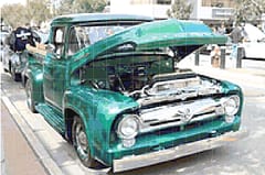
Just that little bit crisper and sharper
Sharpening is one of those things that can make a subtle difference but too much can make things look unreal and produce a “halo” artifact around some parts of the image especially at the lower resolutions (slightly visible above as it was deliberately made stronger to emphasize the effect)
Dithering
Remember how the image quality reduced as we limited the number of colors? This is compounded by the fact that the computer can’t just pick any color, it is limited to the colors available from the thread manufacturers such as DMC or Anchor. They don’t make threads of every possible color so sometimes the computer has to substitute something close and when we’re also limiting the number of those colors too it can be a challenge for it to reproduce the image exactly.
When faced with smooth color variations and a limited palette, the best the computer can do is pick the closest color but this has the effect of producing bands of color in the pattern as they change in steps:
without the intermediate colors available, color banding appears
But what if we could make our own colors? No, I’m not talking about mixing dye in a bucket but it is a little like mixing paint only with threads (you knew I was talking about threads, right? Please, don’t try to paint on your pattern, it will end badly!)
Dithering is a way of mixing colors when you can’t actually mix the colors themselves. By alternating two different colors we can produce the appearance of a third. Here’s a very bright extreme example of how red and blue will appear to be purple when alternated.
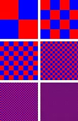
if there’s one thing that Barney the Dinosaur taught me, it’s that you can mix red and blue to make purple
We’re not just limited to 2 colors or alternating single stitches - we can gradually alter the number of each color to produce smoother color gradients and fool the eye into seeing colors that aren’t really there. You’ll see the detail when you’re up close and working on the piece but when you step back and view the completed work, it will look smoother and more realistic. It’s especially noticeable if the image contains graduated color changes such as sky or skin.
Here’s the same example image from earlier with some different dithering applied:

Burkes dithering

False Floyd-Steinberg dithering
Atkinson dithering

Floyd-Steinberg dithering
Images with dithering will tend to look more realistic due to the smoother color changes but the downside is that it makes the pattern more complex to work on as there are fewer bands of solid color and more speckling. If you’re a beginner wanting to make a simple pattern to work on, you may want to consider leaving dithering off completely.
There are also different algorithms that each produce slightly different effects - some retain some of the “banding” effect which will make the patterns slightly easier to work on, others are more aggressive with reproducing the best color-fading effect but may result in a more complex chart as a result. The best approach is to try different ones to see which suits your image best (another reason it’s vital that your software provides quick and immediate feedback).
Let’s go back to our car example and show some of the pattern detail when zoomed in to the front wing of the car (or ‘fender’ if you’re North American) to see what effect dithering has on the pattern complexity:
with no dithering, there are larger blocks of the same color
Dithering adds more ‘speckling’ to the pattern
Applying dithering can also sometimes mean that we can reduce the number of thread colors used in our pattern and still have it look good or use it to create low-color effects:
8 colors and dithering for a quick and simple pattern
single-color with dithering produces an old-fashioned newspaper picture effect
Experiment
There are no predefined set of options that can be applied to every image that will always produce the perfect results. It’s all about experimenting and adjusting things and trying different combinations - sometimes after adjusting the size, the colors can be reduced further or vice-versa.
Over time you will learn how the inputs affect the finished pattern design and having a pattern creation tool that provides an immediate feedback loop really helps with the process but whatever tool you use, I hope this has helped to explain what some of the options do and how they influence the pattern and ultimately, the piece you will hang on your wall.
You spend a long time making it so it’s worth taking the time to get the pattern right first.
Free Pattern
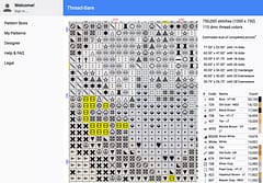
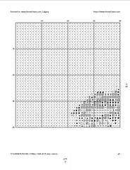
If you like the car pattern featured in this article, we’re making this higher resolution version available for free. It is 450W x 300H and in 96 DMC colors:
It’s available in 3 print-size versions (all the same pattern but with different sized pattern-print):
- Large Print (40 stitches per page)
- Medium Print (60 stitches per page)
- Small Print (80 stitches per page)
All were created using the new thread-bare pattern making tool that we’re working on and hope to make available online very soon. If you stitch it, we’d love if you sent us images of your completed work!
Video Walkthrough
We’ve made good progress with our pattern-making tool since this article was originally written and can now provide a video-walkthrough of some of the techniques described in this article:
Remember to follow our us on our Thread-Bare Stitching Facebook Page or Thread-Bare Stitching Pinterest Channel for news and announcements of availability of the pattern maker and other free charts.